
CASE STUDY
1. The beginning
In the beginning, the artist gave me quite a bit of freedom to do what the song made me feel, just told me it’s about a dark story with an upbeat note. So I went for this abstract form of a skeleton, adding one tear drop slowly dripping down look because the song is quite sad/melancholy but persistent and strong like a skeleton. The original color was green/teal, and the structure of the jaw/teeth was more profound. I played around with the dripping effect and created this other typography version, but we quickly gave that one up because it felt too “hardcore rock“.


2. Going back and forth
We went back and forth with the structure of the skeleton's jaw, as he didn't want it to be too aggressive. He didn't want the skeleton teeth structure to be showing that much, and asked if I can modify it to show less or cover it up. So I did this version and provided more colors.

Still he thought it was too aggressive. So I modified again and did the following three versions of abstractness.

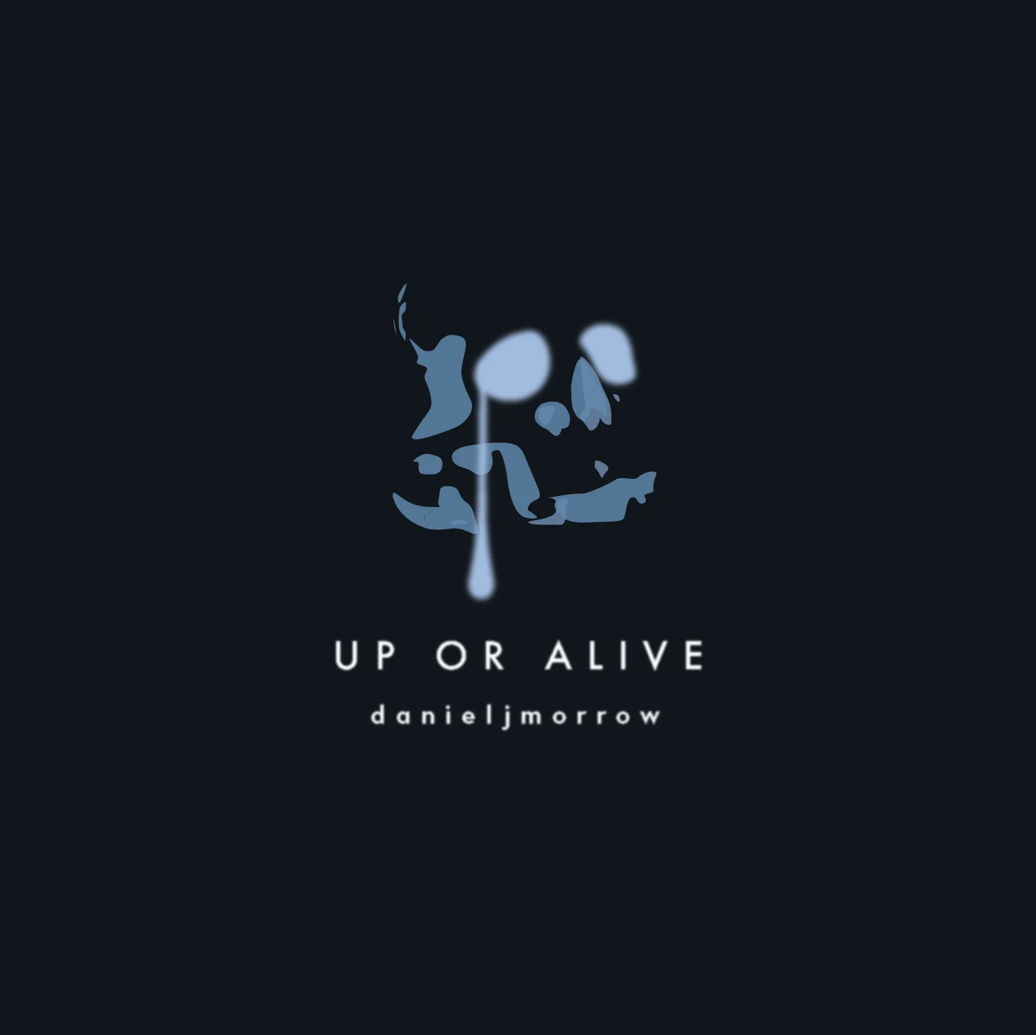
3. Finalizing
Finally we select the most abstract version out of all, and the color navy.
Check out this single now here.